Colours, fonts, icons and shape
Give your public site your own colours and style, with every choice checked so text stays easy to read.
Who can do this: admins only.
Steps
Colours
- Choose Settings in the sidebar, then Public site. The editor is on the left and a live preview of your home page on the right.
- Under Style, click Colours.
- Under Ready-made schemes, pick one of the eight: Meadow, Harbour, Berry, Heather, Terracotta, Lagoon, Sunflower or Slate. Each is already checked. You can stop here, or change any colour below.
- Under Your colours, set:
- Brand colour: buttons, links and headings. White text sits on it.
- Highlight colour: small touches, such as the basket count, quote marks and shapes.
- Background tint: the page colour. Gizzago keeps it pale. Type a hex code such as #2F5D50, or red, green and blue numbers, or click the swatch to pick a colour.
- Read the line under each colour. "Readable: 7.3 to 1 (needs 4.5)" or "Easy to see: 4.1 to 1 (needs 3)" means it passes.
- If a colour is refused, press Use the nearest shade that passes. The button shows the shade it will use.
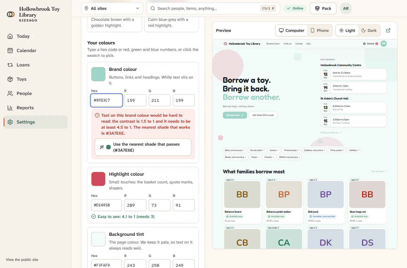
A refused colour shows a red message such as "Text on this brand colour would be hard to read: the contrast is 1.5 to 1 and it needs to be at least 4.5 to 1." The status at the top says "Not saved: fix the choice marked in red." Once it passes, the status reads "Draft saved. Not live yet."
The brand colour needs at least 4.5 to 1 against white, and the highlight at least 3 to 1 against your page. These are the standard checks for readable text. Under Made for you from these, Gizzago shows the colours it works out for you: buttons on hover, quiet text, and dark mode.
Press Look and feel at the top of the pane to go back.
Fonts
- Click Fonts.
- Under Headings, choose the font for big titles, such as Fredoka, Lora or Baloo.
- Under Text, choose the font for everything else. Only fonts that stay clear at small sizes are offered, such as Atkinson Hyperlegible, Nunito or Source Sans.
Icons and shape
- Click Icons and shape.
- Choose an icon set: Lucide, Tabler or Phosphor. Each card shows sample icons.
- Choose Corners: Crisp, Soft or Round.
- Choose Spacing: Snug, Comfortable or Airy.
Each pane has a button to go back to the standard choices, such as Back to the standard colours.
Nothing here is live until you press Publish changes.